


Ten years…
Look back, move forward
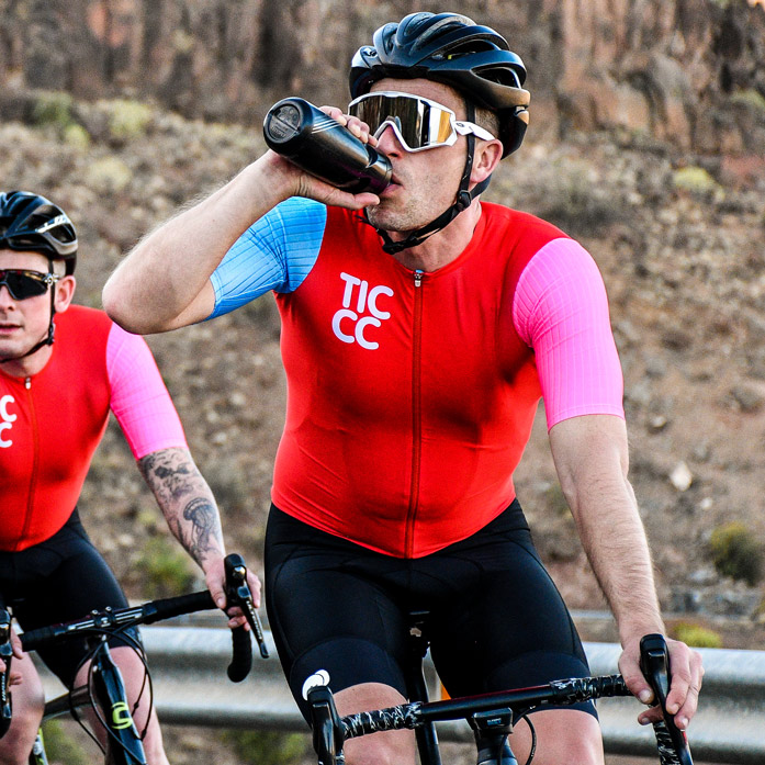
Making the best kit we can has been our objective since day one.
Looking back to admire the view is both beneficial and important. It’s an opportunity to reflect, celebrate achievements and learn lessons for future rides.
Over the past few years, we have been in contact with customers, old and new. It’s been a time to listen, learn and reflect. How are we perceived? Do your views of us reflect our values? What resonates with you? What role do we play in your life on a bike? The dialogue has been fun and informative. It has greatly helped us as we move forward into our next decade.
There were four recurring feedback themes:
01/ Distinctive
The kit and brand are different. They stand alone
02/ Durable
Well-made, beautiful fabrics, long-lasting
03/ Responsible
TICCC is an authentic brand that delivers responsibly made products
04/ Empowering
Our kit makes people feel good
Making the best kit we can has been our objective since day one. Your feedback substantiates that we are definitely on the right track. This valuable insight has given us a clear understanding of what we take on the next sector of our journey and what we leave behind.
We are not changing, just evolving. We are developing our brand to reflect further what we mean to you and our TICCC community.
Empowerment to the people!
In 2015, we introduced our tag: HIGHER, FURTHER, FASTER. At the time, like our kit, it was a distinctive expression of our brand. It stood alone in the cycling sector. Our interpretation of it was never intended as just a literal description of our sport. HFF was intended as a metaphorical expression for going beyond one’s limits to live an empowered life. Daphne’s story of how the bike has helped her cope with chronic pain has resonated with many people. Empowerment is an integral theme and an important part of our story.
On A Good Day
This year, we say goodbye to HIGHER, FURTHER, FASTER, and introduce our new tag: On A Good Day. OAGD reflects the benefits of cycling for mind, body and soul. It is an empowering sentiment that expresses the dynamics of the sport, our purpose and our products.

OAGD dot
The OAGD dot symbolises nature’s power to bring positivity. As bike riders we are acutely aware of this. It serves as a visual reminder of the natural world’s importance and vulnerability. The dot is our call to action symbol.

The new TICCC brand assets will be ‘rolled out’ and featured on forthcoming products and collateral.
